California Flag
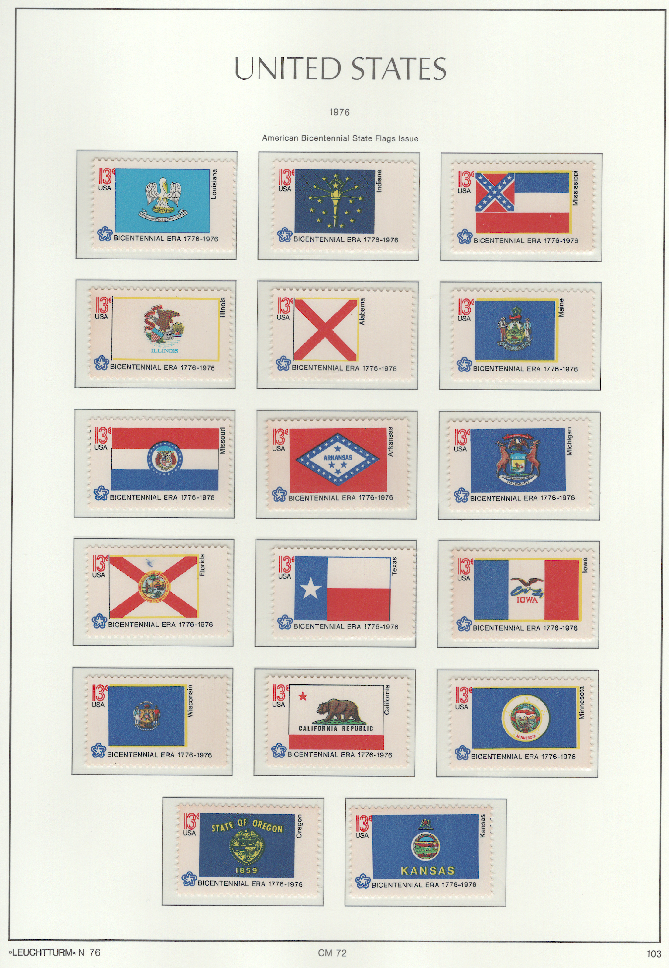
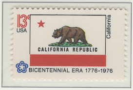
Probably the best flag on this page is the California state flag. The following analysis uses Ted Kaye booklet, Good Flag, Bad Flag for that assessment:
Keep It SimpleCalifornia’s flag is moderately simple: it has a red bar on the bottom, with a field of white – a white background. There’s a red star in the left top corner that was used when it first became a state, to signify it was off in the west by itself. There’s a drawing of a California Grizzly Bear with the words California Republic under it. Overall, it’s a little busy, but not cluttered.Use Meaningful SymbolismAs mentioned above, the star is from when it first became a state: one flag was just a large star; another flag was the stripes of the U.S. flag, but with one large star on the blue field in the left corner. The bear was a native of the state when it was first settled – although originally the bear was pictured standing on its hind legs in a boxing pose.Use a Few Basic ColorsI don’t tend to count white backgrounds and black text. Besides those two colors, there’s just red, green, and brown. So it has a slight exception on the color count, depending on how you view white and black.No Lettering or SealsThis one violates the lettering rule by including the text, California Republic. But that is meaningful in that after the Mexican War of Independence, California and Texas broke free of Mexico and Spain and were independent republics – California was so for twenty-five years before joining the U.S.Be Distinctive or Be RelatedCalifornia’s flag is almost nothing like any of the other state flags. It has one related component: the lone star. The star ties it to Texas and to the U.S. Whether its flapping in the wind or not, you can recognize that it’s the California flag.
California’s flag passes almost all of Kaye’s elements of a good flag. I think it would look better without the text. Otherwise it looks great.
Note
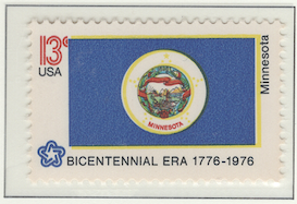
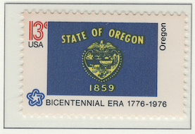
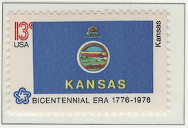
It’s amazing how many of these flags fail Ted Kaye’s criteria for a good flag design. So many of them have a dark blue field with the seal of the state in the middle, along with a slogan and the name of the state. It’s like they didn’t feel like asking an artist to help design the flag. They don’t realize that a flag is a symbol of the state’s pride. Their flags indicate they have very little pride – and no artistic taste.
Contains 17 spots: own 17 – 17 unused, 0 used.
Page is finished.
Album or Web Page Last changed May 5, 2025
Stamp Details
The table below lists information about the stamps shown on this page of Lighthouse’s stamp album. For more details about a particular stamp, click on its description. That will take you to the related web page of Colnect.
spot |
own |
catalog |
subject |
description |
comment |
Flag Series
✓ |
1650 |
13c (feb 1976) |
|||
✓ |
1651 |
13c (feb 1976) |
|||
✓ |
1652 |
13c (feb 1976) |
|||
✓ |
1653 |
13c (feb 1976) |
|||
✓ |
1654 |
13c (feb 1976) |
|||
✓ |
1655 |
13c (feb 1976) |
|||
✓ |
1656 |
13c (feb 1976) |
|||
✓ |
1657 |
13c (feb 1976) |
|||
✓ |
1658 |
13c (feb 1976) |
|||
✓ |
1659 |
13c (feb 1976) |
|||
✓ |
1660 |
13c (feb 1976) |
|||
✓ |
1661 |
13c (feb 1976) |
|||
✓ |
1662 |
13c (feb 1976) |
|||
✓ |
1663 |
13c (feb 1976) |
|||
✓ |
1664 |
13c (feb 1976) |
|||
✓ |
1665 |
13c (feb 1976) |
|||
✓ |
1666 |
13c (feb 1976) |
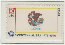
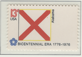
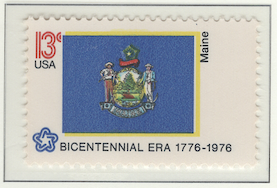
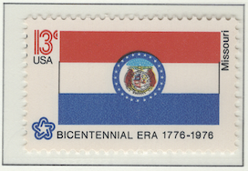
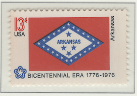
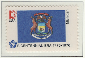
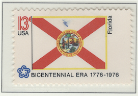
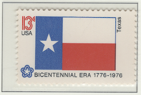
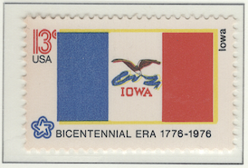
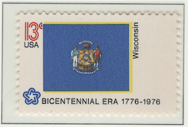
Footnotes
Spot refers to the postion of the stamp on the album page (e.g., 3.2 indicates row 3, position 2).
Amt. is an abbreviation for the face amount of the stamp.
Own indicates the stamp status: ✓ for unused; ✗ for used or canceled; ⭑ signifies I ordered one; ; ✨ indicates it was bought recently; ✠ means an auction bid is pending; and ◎ is used, and it costs too much for unused.
To search by catalog number, go to the search box and enter it in the catalog number box. However, it’s a bit broken; I need to fix it.
















