Flags: Finland & India
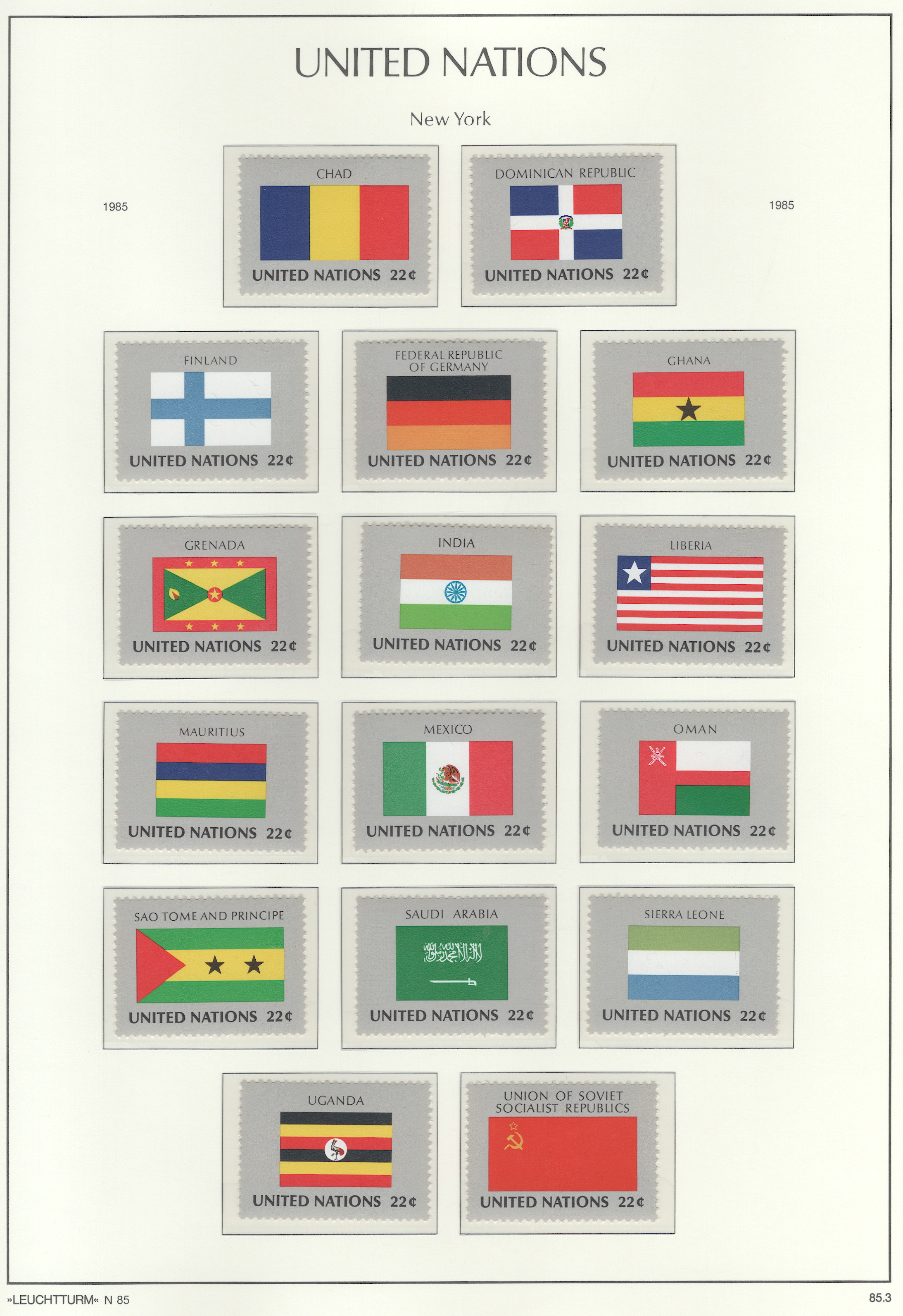
For designing a flag, the North American Vexillological Association recommends a booklet by Ted Kaye called, Good Flag, Bad Flag. Based on it’s criteria, there aren’t many good choices on this page. But I’d say that Finland and India have the best of this batch. The following analysis uses Ted Kaye booklet for that assessment:
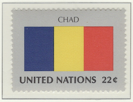
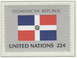
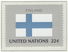
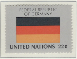
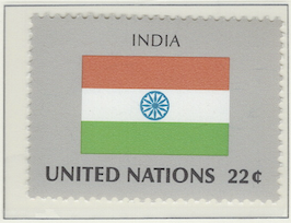
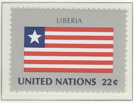
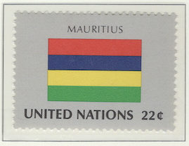
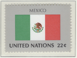
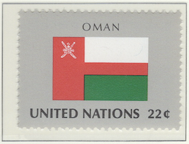
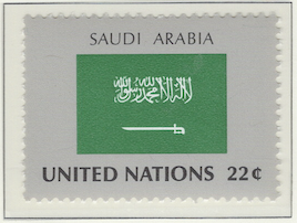
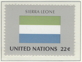
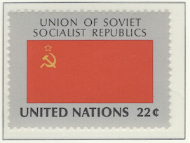
Keep It SimpleThe flags of Chad, Finland, Germany, Siera Leone are pretty simple. However, I don’t like the color combination of Chad. Germany is too much like the Belgium flag, except that the bands are horizontal rather than vertical. I like the pastel colors of Siera Leona, but the may not be bold enough for use in battle – a main point of flags.Use Meaningful SymbolismThe India flag is in keeping with the European style – perhaps in recognition of the fact it was a former colony – but its horizontal colors are that of Hungary. However, the simple spinning wheel at the center is meaningful in that it’s an image from their founder, Mohandas Gandhi.Use a Few Basic ColorsMauritius is fairly unique with four bands, but that’s too many colors that aren’t used wisely. Plus, it’s too dark. Finland has only two colors, but with so much white, it looks more like a deviation from a surrender flag. The Soviet flag has only two colors, but it’s too similar to its neighbor, China.No Lettering or SealsThe Mexico flag is attractive, but it’s complicated by a detailed seal and the three color bands are the same as Italy. Saudi Arabia has a distinctive flag, but that decorative looking swirls is Arabic lettering. It says, “There is no god but Allah; Muhammad is the Messenger of Allah”. The Dominican Republic included a small crest, violating this rule.Be Distinctive or Be RelatedOman has a distinctive flag. I’m not sure about the horizontal red stripe, though. It would look better without it. The Soviet flag is that of a communist country and is related to the flag of the other major communist country of the time, China. Liberia is similar to the U.S. flag since it has some history with the U.S. from the time of its founding.
Note
As I mentioned elsewhere, there are several album pages containing flags. Although maps can be neat, this flag series is boring – which was issued only from New York and not from Geneva or Vienna. I’ve tried to make it interesting by doing a critique of some of the flags, pointing out which are well done and which aren’t very good.
Contains 16 spots: own 16 – 16 unused, 0 used.
Page is finished.
Album or Web Page Last changed Jun 11, 2025
Stamp Details
The table below lists information about the stamps shown on this page of Lighthouse’s stamp album. For more details about a particular stamp, click on its description. That will take you to the related web page of Colnect.
spot |
own |
catalog |
subject |
description |
comment |
Flag Series
✓ |
460 |
22c (sep 1985) |
|||
✓ |
461 |
22c (sep 1985) |
|||
✓ |
465 |
22c (sep 1985) |
|||
✓ |
451 |
22c (sep 1985) |
|||
✓ |
463 |
22c (sep 1985) |
|||
✓ |
450 |
22c (sep 1985) |
|||
✓ |
457 |
22c (sep 1985) |
|||
✓ |
458 |
22c (sep 1985) |
|||
✓ |
459 |
22c (sep 1985) |
|||
✓ |
453 |
22c (sep 1985) |
|||
✓ |
462 |
22c (sep 1985) |
|||
✓ |
455 |
22c (sep 1985) |
|||
✓ |
452 |
22c (sep 1985) |
|||
✓ |
464 |
22c (sep 1985) |
|||
✓ |
454 |
22c (sep 1985) |
|||
✓ |
456 |
22c (sep 1985) |
Footnotes
Spot refers to the postion of the stamp on the album page (e.g., 3.2 indicates row 3, position 2).
Amt. is an abbreviation for the face amount of the stamp.
Own indicates the stamp status: ✓ for unused; ✗ for used or canceled; ⭑ signifies I ordered one; ; ✨ indicates it was bought recently; ✠ means an auction bid is pending; and ◎ is used, and it costs too much for unused.
To search by catalog number, go to the search box and enter it in the catalog number box. However, it’s a bit broken; I need to fix it.
















No Covers Found.