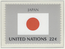
Flags: Japan
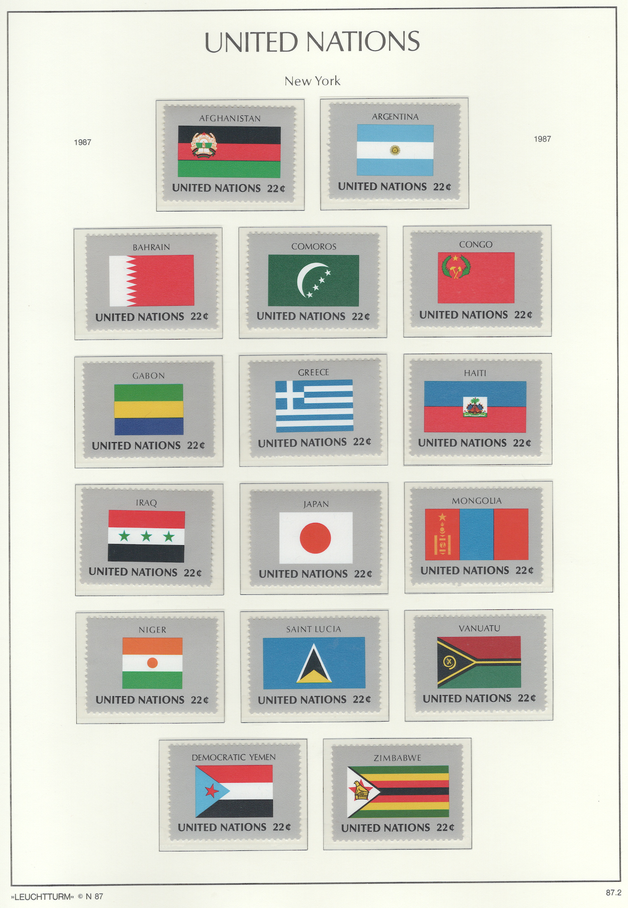
For designing a flag, the North American Vexillological Association recommends a booklet by Ted Kaye called, Good Flag, Bad Flag. Based on it’s criteria, Japan’s flag is very good. The following analysis uses Ted Kaye booklet for that assessment:
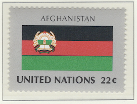
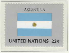
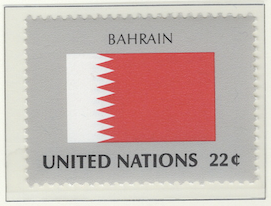
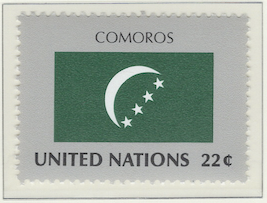
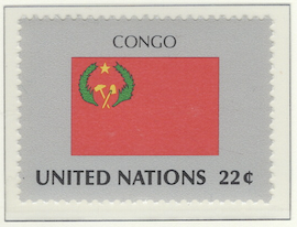
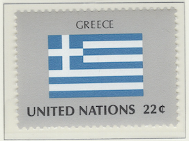
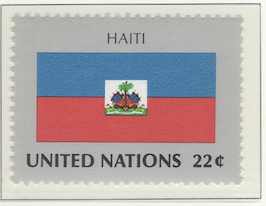
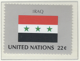
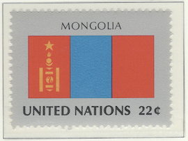
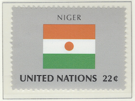
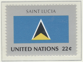
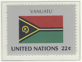
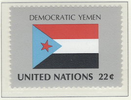
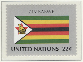
Keep It SimpleThere’s hardly a flag simpler than that of Japan: a large red dot on a white field. It’s fairly easy to identify and even easier for childred to draw it – they just need to be scolded not to draw a smiling face on the dot. The Bahrain flag is fairly simple, although it might be difficult for children to get the jagged edges between the two fields right. Iraq has a simple, tri-color design with three stars, making it moderately easy to reproduce and to recognize from afar – were it not for its neighbor Syria.Use Meaningful SymbolismWhen the flag of Japan was designed in the 1800s, their mythology said that their emperor was descended from the sun god. So the red dot is supposed to be the sun and emperor. Japan is called the land of the rising sun – perhaps because it’s east of the rest of Asia. Hence, the sun depicted on the flag is red, like an early morning sun on the horizon. The Mongolia flag is distinct and has symbolism with what’s called the Soyombo: it represents the sun, moon, earth, fire, water, and the yin yang pair of fish – like fish suppposedly never sleeping, the people’s spirit never sleeps.Use a Few Basic ColorsArgentina kept the bulk of their flag to two colors. They complicated it with two more colors making a small sun – which has a face. Argentine kids must love drawing that flag. As for Japan, they win on this with two colors, with one being white which is kind of a neutral color. Bahrain has basically the same two colors. Greece has only two colors, but overuses them. Comoros has two, but the charge of a crescent moon with four stars strung across it looks kind of silly and too busy.No Lettering or SealsAfghanistan and Haiti violate the no-seal policy. Congo, Vanuatu, and Zimbabwe have some small, complicated art that are like seals. They’re at least not simple. The Iraq flag is a contender, but the three stars were meant to represent the proposed union with Syria and Egypt. As a result, it became Syria’s flag with a switching of colors. But the uniting of the three countries never happened, making the flag confusing.Be Distinctive or Be RelatedSaint Lucia’s flag is distinctive for a country flag, but it looks like something from Star Trek. Yemen is related to other Arab countries (i.e., Iraq, Kuwait, and Sudan), but it’s too similar and would be lost in a joint military operation of the Arab League – which happened in the first Iraq war. The design of Bahrain’s flag would be unique if it weren’t for the Qatar flag being identical but with brownish red.
Note
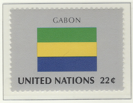
As I mentioned elsewhere, there are several album pages containing flags. Although maps can be neat, this flag series is boring – which was issued only from New York and not from Geneva or Vienna. I’ve tried to make it interesting by doing a critique of some of the flags, pointing out which are well done and which aren’t very good.
Contains 16 spots: own 16 – 16 unused, 0 used.
Page is finished.
Album or Web Page Last changed Jun 12, 2025
Stamp Details
The table below lists information about the stamps shown on this page of Lighthouse’s stamp album. For more details about a particular stamp, click on its description. That will take you to the related web page of Colnect.
spot |
own |
catalog |
subject |
description |
comment |
Flag Series
✓ |
513 |
22c (sep 1987) |
|||
✓ |
507 |
22c (sep 1987) |
|||
✓ |
511 |
22c (sep 1987) |
|||
✓ |
499 |
22c (sep 1987) |
|||
✓ |
508 |
22c (sep 1987) |
|||
✓ |
504 |
22c (sep 1987) |
|||
✓ |
514 |
22c (sep 1987) |
|||
✓ |
512 |
22c (sep 1987) |
|||
✓ |
506 |
22c (sep 1987) |
|||
✓ |
503 |
22c (sep 1987) |
|||
✓ |
501 |
22c (sep 1987) |
|||
✓ |
509 |
22c (sep 1987) |
|||
✓ |
510 |
22c (sep 1987) |
|||
✓ |
502 |
22c (sep 1987) |
|||
✓ |
500 |
22c (sep 1987) |
|||
✓ |
505 |
22c (sep 1987) |
Footnotes
Spot refers to the postion of the stamp on the album page (e.g., 3.2 indicates row 3, position 2).
Amt. is an abbreviation for the face amount of the stamp.
Own indicates the stamp status: ✓ for unused; ✗ for used or canceled; ⭑ signifies I ordered one; ; ✨ indicates it was bought recently; ✠ means an auction bid is pending; and ◎ is used, and it costs too much for unused.
To search by catalog number, go to the search box and enter it in the catalog number box. However, it’s a bit broken; I need to fix it.
















No Covers Found.