Flags: Canada & Somalia
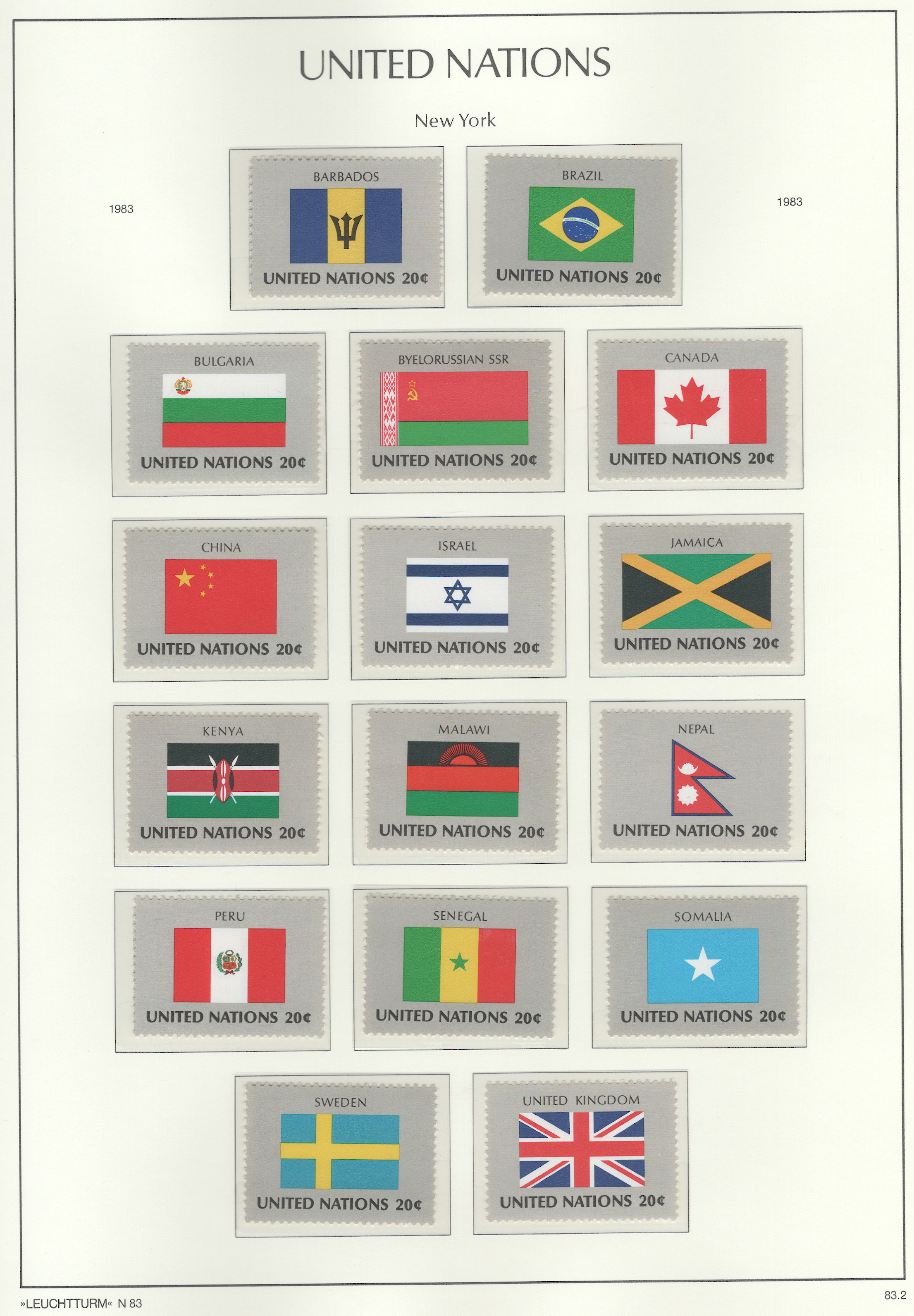
For designing a flag, the North American Vexillological Association recommends a booklet by Ted Kaye called, Good Flag, Bad Flag. Based on it’s criteria, there are a few goods flags on this page. It’s difficult to choose the best one. The following analysis uses Ted Kaye booklet for that assessment:
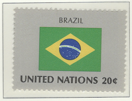
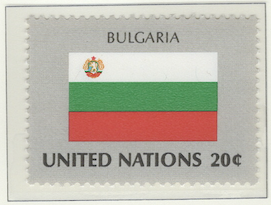
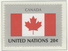
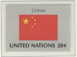
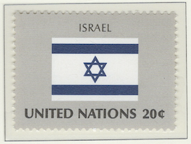
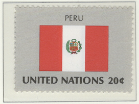
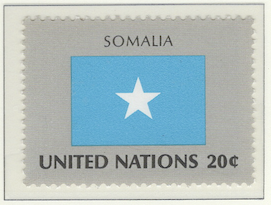
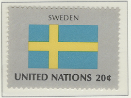
Keep It SimpleThe simplest design of these flags is that of Somalia: an azure field with a single white star in the middle. It’s easy to draw and to see from far away. Brazil’s flag is unique and meaningful, but it’s difficult to draw precisely – it’s not simple when you look closer.Use Meaningful SymbolismThe Israel flag is has meaningful symbolism in that it has the star of David on it, a biblical ancestrial king of Israel and a symbol of their official religion. Although it may be distinct, I’m not so sure it would be easily identifiable when completely at rest of a mast, with no wind blowing. It could be confused with a corporate flag.Use a Few Basic ColorsThe China flag uses two colors: a red field with five gold stars – one large, and four small stars. Sweden also uses only two colors: a deep blue field with a Nordic gold cross. Canada uses two colors, but manages to use them to include a simple logo – a maple leaf.No Lettering or SealsOn this page, the Bulgaria and Peru flags in particular violate this rule with their seals or crests. Canada and Israel have symbols, but not seals and they’re not too complicated to draw.Be Distinctive or Be RelatedThe Sweden flag is somewhat distinct in that it’s a 5:8 ratio. Only a few other country flags are like this. The most distinctive one on this page is the Nepal flag because it’s shape. However, that shape is reserved usually for nautical flags. It looks like a warning of gale force winds approaching.
Of the better flags on this page, I’d have to say that Canada is my favorite. It has a fresh and crisp look given the use colors and the maple leaf logo makes it distinct and recognizable from afar. I have good feelings when I see it. My second choice would be Somalia just because of the pure simplicity of it.
Note
As I mentioned elsewhere, there are several album pages containing flags. Although maps can be neat, this flag series is boring – which was issued only from New York and not from Geneva or Vienna. I’ve tried to make it interesting by doing a critique of some of the flags, pointing out which are well done and which aren’t very good.
Contains 16 spots: own 16 – 16 unused, 0 used.
Page is finished.
Album or Web Page Last changed Jun 11, 2025
Stamp Details
The table below lists information about the stamps shown on this page of Lighthouse’s stamp album. For more details about a particular stamp, click on its description. That will take you to the related web page of Colnect.
spot |
own |
catalog |
subject |
description |
comment |
Flag Series
✓ |
400 |
20c (sep 1983) |
|||
✓ |
413 |
20c (sep 1983) |
|||
✓ |
409 |
20c (sep 1983) |
|||
✓ |
404 |
20c (sep 1983) |
|||
✓ |
410 |
20c (sep 1983) |
|||
✓ |
407 |
20c (sep 1983) |
|||
✓ |
402 |
20c (sep 1983) |
|||
✓ |
405 |
20c (sep 1983) |
|||
✓ |
406 |
20c (sep 1983) |
|||
✓ |
403 |
20c (sep 1983) |
|||
✓ |
401 |
20c (sep 1983) |
|||
✓ |
408 |
20c (sep 1983) |
|||
✓ |
412 |
20c (sep 1983) |
|||
✓ |
411 |
20c (sep 1983) |
|||
✓ |
414 |
20c (sep 1983) |
|||
✓ |
399 |
20c (sep 1983) |
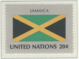
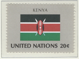
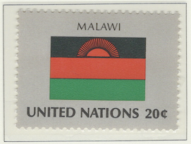
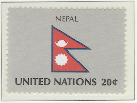
Footnotes
Spot refers to the postion of the stamp on the album page (e.g., 3.2 indicates row 3, position 2).
Amt. is an abbreviation for the face amount of the stamp.
Own indicates the stamp status: ✓ for unused; ✗ for used or canceled; ⭑ signifies I ordered one; ; ✨ indicates it was bought recently; ✠ means an auction bid is pending; and ◎ is used, and it costs too much for unused.
To search by catalog number, go to the search box and enter it in the catalog number box. However, it’s a bit broken; I need to fix it.
















No Covers Found.